What's new
The next major iteration of Origami, o3
Origami components are independently versioned, we iterate regularly. o-buttons is at version 7, o-table is at version 9.
The overarching approach we follow to design and build components is also versioned. By comparison to individual components, these standards are remarkably stable.
Origami v1 (o1) launched around 2013; Origami v2 (o2) around 2020; and as of 2024 we’re now moving to Origami v3 (o3). It might be our most significant upgrade ever.
So, what’s new with o3?
o3 feature highlights
- Design guidelines so we know where and why to use components.
- Accurate Figma libraries for each supported brand.
- Integrated design and engineering tooling for collaboration.
- A reusable capability with multi-brand support.
- Modernised technical architecture.
Reader benefits
- Consistency: intuitive design across FT products.
- Fidelity: of experience to match our quality journalism.
- Accessibility: enhanced and applied across FT Group products.
- Trust: always an on brand experience.
- Product: features delivered more quickly with fewer bugs.
How do o3 features help achieve these exactly? Let’s look in more detail.
Metric 2 (Variable Font, VF)
Modern Origami introduces the Metric2 font family as a variable font (a incremental font weights). We use a single typographic scale for all fonts.
Metric2 replaces legacy Metric font files. Metric2 renders larger than Metric for the same font size, therefore you may need to use a smaller scale to align with legacy Metric typography.
Design guidelines
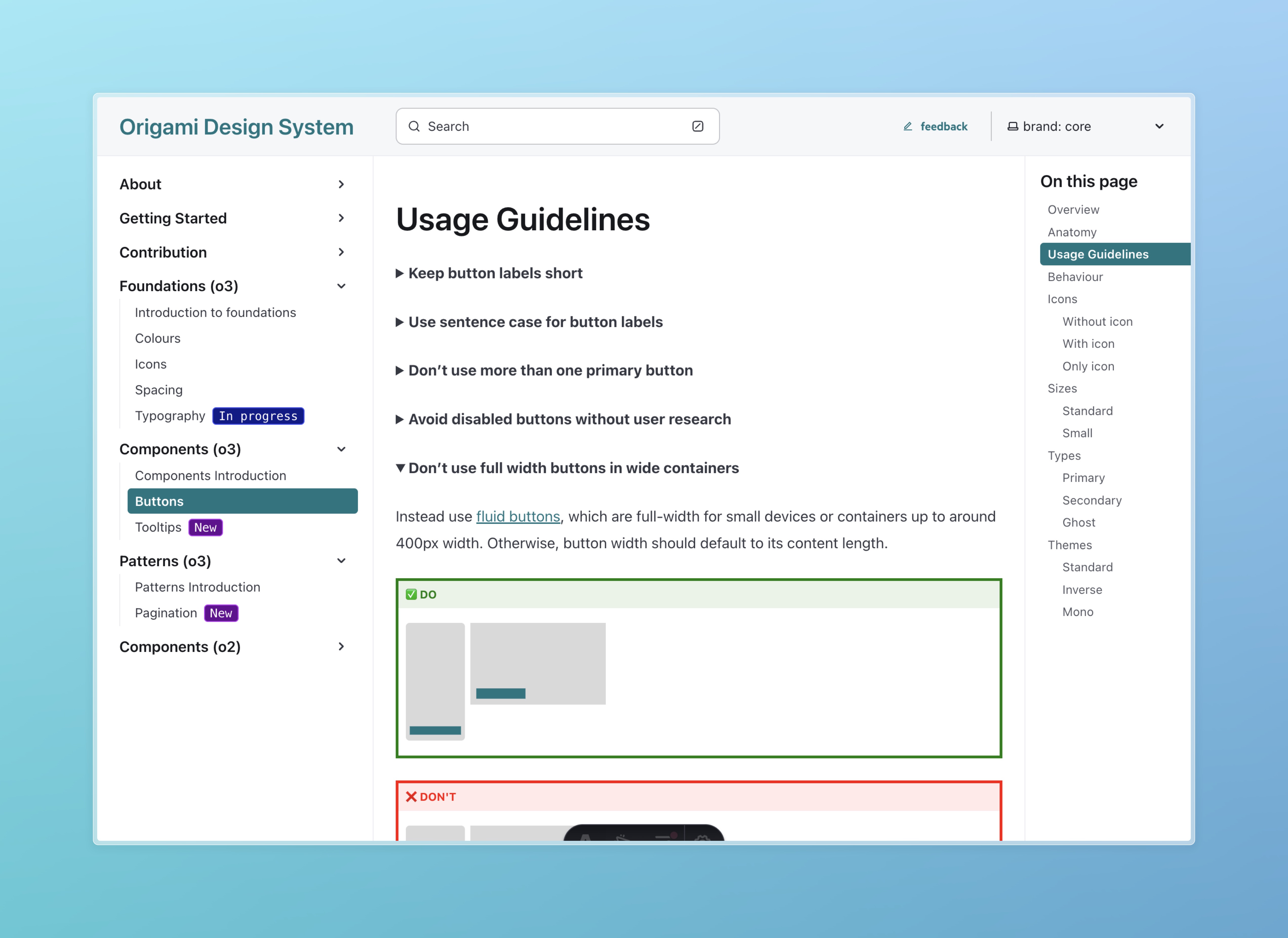
We’ve always heard pretty good feedback about our technical documentation. For the most part engineering teams know how to use Origami. They don’t always know where or why, and designers are left guessing too. This leads to user interface being reused in ways never intended. Forced into place for unsuitable purposes which can lead to a confusing, inconsistent, or inaccessible product experience.
All Origami components now include thorough design guidelines. These capture our design thinking, along with justifying user research, and provide clear do’s and don’ts for reuse in new products or features.
Figma libraries
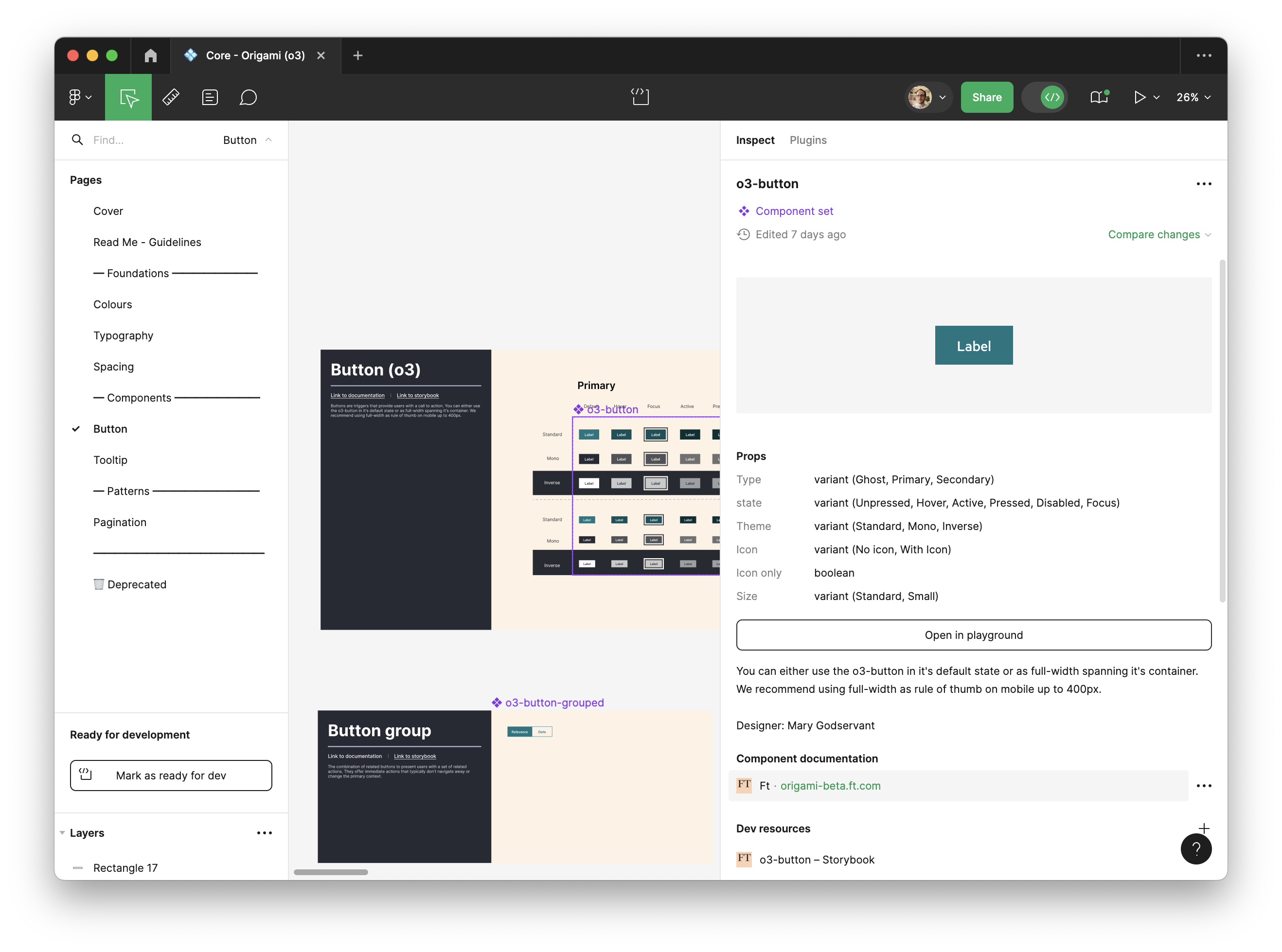
For engineers to engineer with re-usable components and patterns, designers need to design with them. Since switching from Sketch to Figma many years ago our tooling for designers has been massively lacking.
Whilst an engineer can reach for a button, a header, or table designers are often left browsing our sites and apps to reverse engineer a design, adding to Figma again and again.
This makes onboarding for a designer a daunting task, where to begin? Is this design in a random file left from my predecessor something reusable, that an engineer can implement in 10 minutes and a user will find familiar, or a custom one-off thing that will take 10 days and look out of place?
By providing design libraries for all supported brands, o3 aims to improve designer efficiency and confidence in our reusable components. A designer can deliver an on-brand experience and focus on what really adds value – rather than reinvent the wheel.
Collaboration tooling
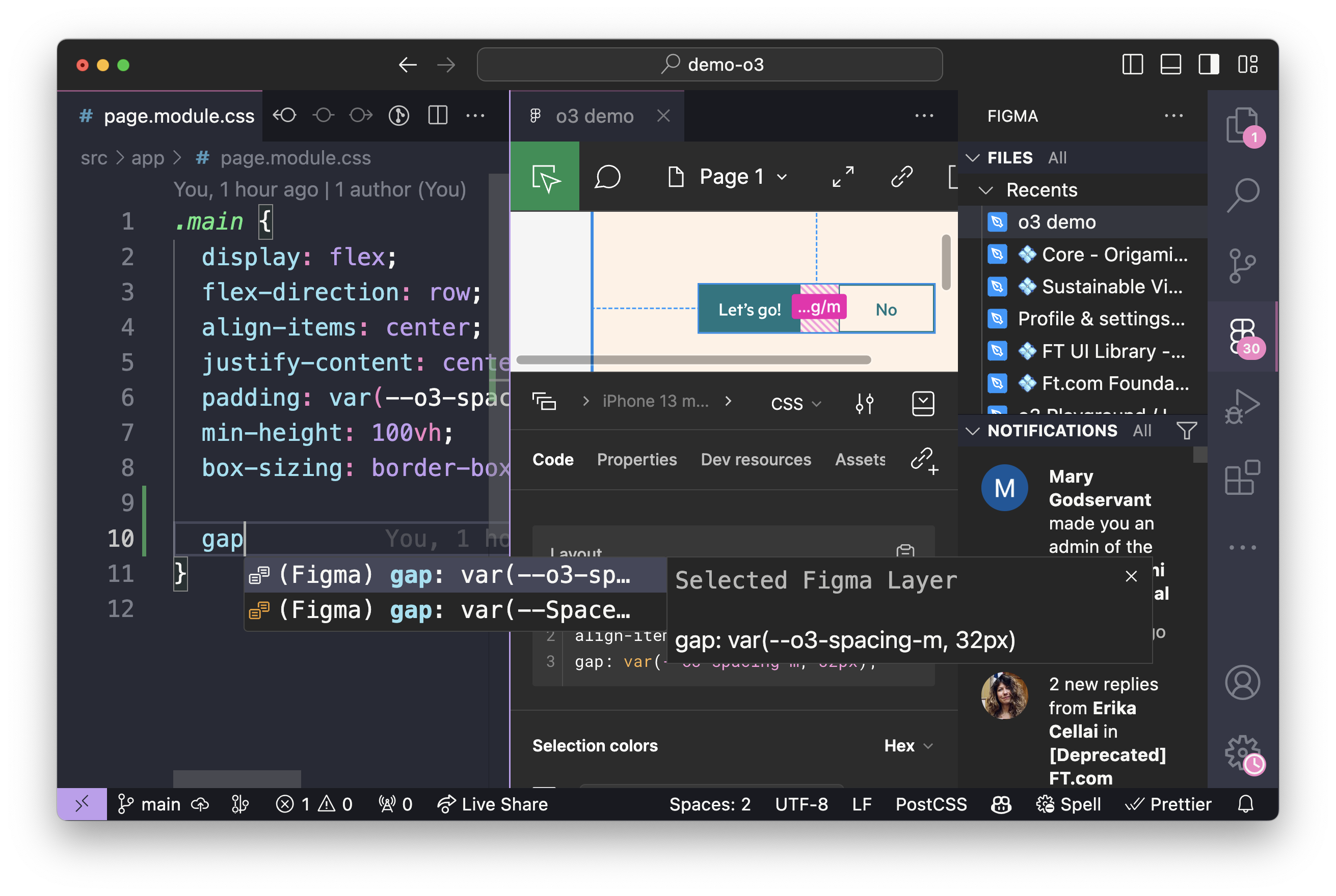
o3 introduces an aligned Origami experience across Figma and code to support designers and engineers to collaborate.
A designer can preview a live component right within Figma, to check their expectations; an engineer can see at a glance what parts of a design are standard Origami, and what parts require their full attention for a custom build.
Removing everyday confusion here will improve our ability to estimate work and save brain power for the deeper conversations between designer and engineer than enable a top quality product.
The following screenshot shows the VSCode IDE with Figma plugin. Code autocompletion is powered by the Figma design itself.
Reusable capability
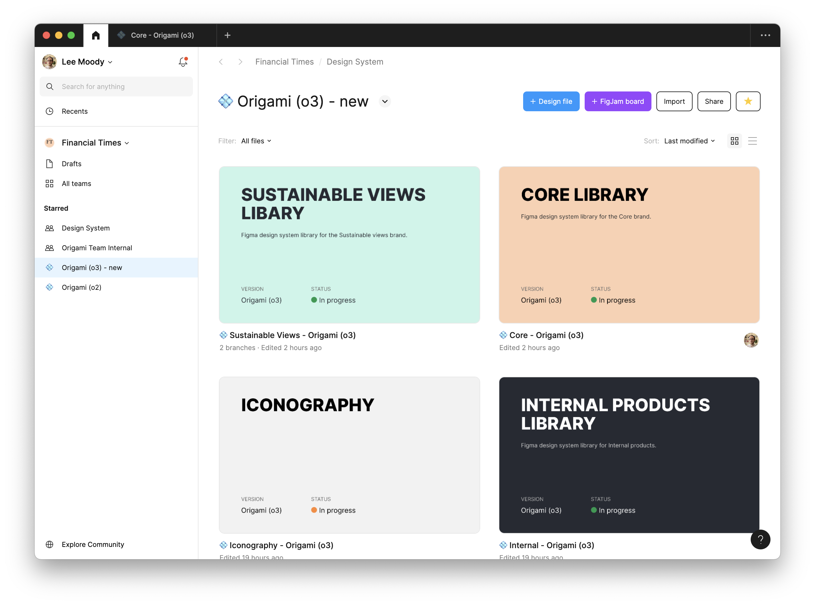
o3 is built using design tokens which allow us to synchronise design decisions across platforms and support multiple brands.
We’re adding support for our first Specialist brand, Sustainable Views, with the help of the Specialist team.
The work of the Specialist team goes into building reusable components that also benefit ft.com and vice versa. Using Origami we’re able to distribute effort and benefit from each other’s expertise and successes.
We focus on building a single high quality, tried and tested user interface with brand customisations.
Small bundle size, few requests
Our new o3-button and o3-foundation packages are 7x smaller than their “o2” counterpart uncompressed and still over twice as small when gzip compression is applied. Number of network requests is also reduced from… many… to zero as we can now colour iconography on-device rather than make extra requests to the Origami Image Service.
This will reduce the loading time for readers when we’ve completed the migration from o2 to o3 Origami. Through reduced reliance on compression there’s especially potential to reduce time to first contentful paint for low powered devices. Hurray for FT on the train!
Faster build times
In March 2024, engineers working on the ft.com article page spent over 5 wasted hours waiting for Sass code to compile. As one project, excluding its dependencies, that’s a lot of wasted time.
Slow build times inhibit our ability to iterate and deliver, and gives ample opportunities for distraction… and doom scrolling… as we wait.
We can’t blame Sass too much, it’s wonderful, but we have a large estate of complex Sass that has become slow. There’s work we can do to reduce this time (Slack), but in our view, now is the time to migrate away from Sass. With o3 Origami there’s no more waiting for Sass to compile, just fast visual feedback and quick iterations.

Modern codebase
No more Sass, web component technology, and dedicated JSX templates with types for React users. Check it out, finally, official Origami types for autocompletion:
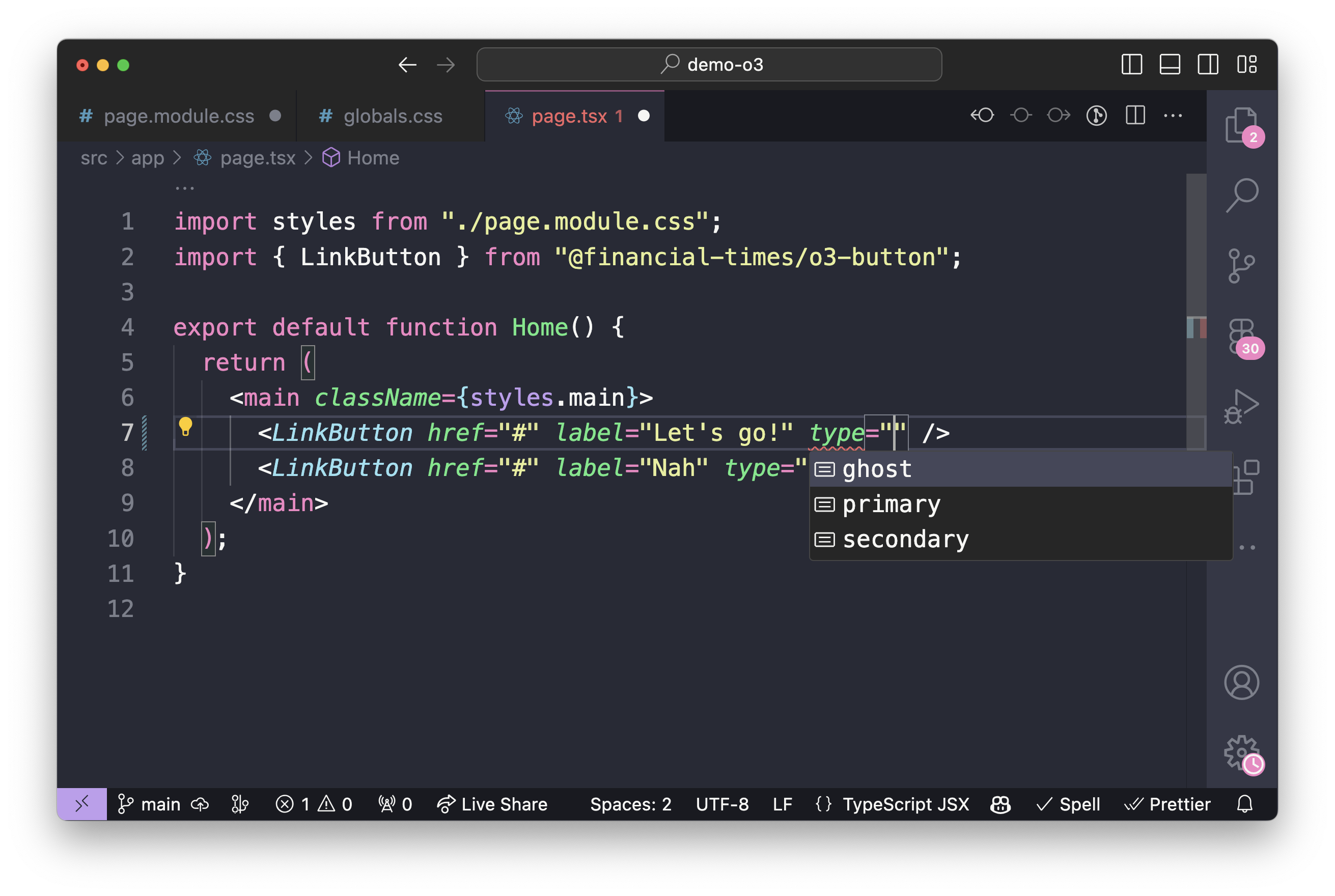
As of 2022, 109 FT GitHub projects included custom JSX templates for Origami components. Likely this has grown with React use at the FT. Now we have a central source for templates we can stop repeating that work going forward.
Wrap-up
Origami v3 (o3) marks a big step forward in how we approach design and development. It introduces design guidelines and Figma libraries that ensure all components are used correctly and consistently, which helps improve the usability of our websites and apps.
These tools boost the efficiency of designer and developer workflows. It does this by reducing frustrating barriers: freeing time to focus on key product differentiators rather than reinventing the wheel, and by allowing both to communicate intent whilst collaborating. Best of all, we can scale these to further brands.
This means we can roll out new products and features more swiftly, more thoughtfully, and with fewer errors. Together, o3 enhancements aim to significantly improve the experience for our readers.

